If you’ve ever dabbled in cartography, geography, cultural imperialism, or that one scene from The West Wing, you’ve probably heard of the Mercator projection. If not, you’ve certainly seen it. The Mercator projection is the most common map projection for general-purpose world maps.
What is a map projection?
Map projection” describes any method of rendering the surface of the Earth onto a plane for easy viewing and storage. Because the sphere has curvature and the plane does not, any projection must have distortion in it, and because of the Hairy Ball Theorem, that distortion must always be extreme somewhere. Since it is mathematically impossible to create a perfect map of the Earth, there is much ongoing debate about which projections are best in which contexts. In such debates, to the Mercator projection is typically pointed as an overused, obsolete projection. It is, in a manner of speaking, the Comic Sans of map projections. Today, however, I seek to change the negative perception of Mercator by demonstrating that not only is it better than many of its commonly cited alternatives, but is actually the best map projection for many modern uses.

The Mercator Projection
Firstly, why do people dislike Mercator? As previously stated, every projection must distort something. In Mercator, this is size. Landmasses near the poles appear much larger than those near the equator. The most commonly cited falsehood present in a Mercator map is the size of Greenland relative to that of Africa – Mercator shows them as roughly the same size, whereas Greenland is, in fact, 14 times smaller. This distortion is necessary to preserve what Mercator is designed to preserve: loxodromes.
A loxodrome, or rhumb line, is a line of constant bearing. While it is not the shortest path between two points on the Earth’s surface, it is the simplest one for sailors navigating with charts and compasses. In 1569, therefore, with this user group in mind, the Belgian Gerardus Mercator designed his projection such that loxodromes rendered as straight lines. Furthermore, the angles of loxodromes on the map matched their bearings on the Earth, such that sailors could calculate the bearing in which to sail with a Mercator projection and a protractor.
Over time, as European explorers, Mercator projections in hand, took over the world, Mercator became the de facto standard projection for all world maps, be they for decoration or education. As a result, many laymen began taking its distortion for truth, believing that regions near the equator were in fact as small as they appeared on the map. Because regions near the equator tended to be poorer than regions near the North Pole, this faulty mindset came to be criticized as cultural imperialism.
To be clear, the fact that Mercator’s Europe appears so large compared to Africa is a coincidence, not an intentional slight to non-Europeans. Cartographers across the world acknowledged the overuse of Mercator and, over the centuries, proposed many alternatives in an attempt to disperse the misconceptions caused by it. None were successful in overcoming Mercator’s tight grip on society.
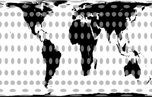
In 1973, however, one Arno Peters claimed to have the solution, a revolutionary new projection that perfectly preserved the sizes of countries. This map, according to Peters, was the only “area-correct” map, with “absolute angle conformality,” “no extreme distortions of form”, and “total… distance-factual[ity]”.*
The Gall-Peter’s Projection
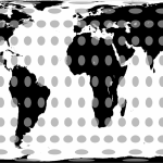
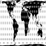
Cartographers were unimpressed. Some might even say they were Galled. Peter’s projection, a simple cylindrical equal-area projection, was by no means original. The exact projection had already been described in 1855 by James Gall, and it differed only in aspect ratio from the also preexisting Tobler World in a Square (1986), Balthasart (1935), Trystan Edwards (1953), Smyth-Craster (1870), Behrmann (1910), and Lambert cylindrical (1772) projections (all pictured at the end of the article).
Whether Peters knew about the existence of any of these maps is a matter of debate, but there is no uncertainty that most of the things he claimed about his “invention” were completely false.
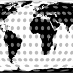
The only area-correct map? There are dozens of named equal-area projections, most of which, such as Tobler’s elliptical projection (pictured at the end of the article), are more accurate than Gall-Peters. Absolute angle conformality? Gall-Peters is by no means conformal; that is a specific term reserved for the elite likes of Mercator, Stereographic, Pierce Quincuncial, and a few others. No extreme distortions of form? Landmasses near the poles are distorted beyond recognition, and landmasses on the equator are twice as tall as they should be, a factor that arguably borders on “extreme”. Total distance factuality? The only correct distances are East-West distances along the standard parallel, which Peters chose as 45 degrees. While the Eurocentricism present in Mercator is a coincidence, it is harder to argue the same for Peter’s arbitrary choice of the standard parallel that intersects most of the Western world. Other popular claims, that North-South lines run vertically and East-West lines run horizontally, are true of all cylindrical projections, including Mercator, and pose no real benefit by themselves.
Despite all this, his campaign worked. The “Peters World Map” spread like wildfire, fanned by Peter’s compelling case of falsehoods and the world’s burgeoning dislike for Eurocentricism and cultural imperialism. It even continues to be popular today. In 2001, it was featured prominently in an episode of The West Wing. The Oxford Cartographers officially sanction the Gall-Peters projection. Just this May, new legislature here in Boston required public schools to use the Gall-Peters projection to teach geography.
But enough about the Gall-Peters projection. The fact that its main competitor is awful doesn’t make Mercator any better. There are still hundreds of projections from which to choose, and compared to those, the Mercator is still outdated and biased, right?
I direct your attention to Google Maps, perhaps the most-viewed map in the world. While Google’s choice of the Mercator projection may seem a simple case of ignorance, Mercator is objectively the best projection for online map applications for the same reason it was objectively the best for naval explorers pre-GPS: loxodromes. If lines of constant bearing are straight lines, then the angles at which they intersect are also constant, both on the sphere and on the plane. This means that perpendicular intersections on Earth look perpendicular on the map.
Furthermore, because Mercator is cylindrical, North is always up, East always right, etc. This is not prejudice; this is convention. Navigation is significantly easier, especially for those not well versed in maps, when all maps of the same area face the same direction.
Together, these properties mean that a Google Maps user can zoom into the image and see their location mapped out with no distortion of shape or direction, and have that image match exactly any other local maps they might own. Who cares about size distortion when users will rarely look at an area bigger than 100 kilometers? Any other map projection would be incompatible with Google Maps, as either North would change direction unpredictably based on the user’s location, or streets would skew, making it difficult to compare the map to the user’s surroundings. For this reason, Mercator holds and deserves a special place in our internet culture.
Perhaps the most useful quality of Mercator, though, is its status as an anathema. People like few things more than something about which to complain. Mercator has long been the first thing novice cartographers learn to dislike. I realise that, if my case was successful, I may have damaged this property for you. Worry not. If you need a map projection to truly hate, and the Gall-Peters projection is not ugly enough (controversy aside, it’s not _that_ bad of a projection), then look no further than the space between the pool room and the mail room, where a Van der Grinten projection hangs for the college to see.

The Van der Grinten Projection
The Van der Grinten projection, National Geographic’s projection of choice from 1922 to 1988, is often confused with Mercator. Make no mistake, though. Loxodromes are not straight lines on Van der Grinten, nor is North always up. Invented in 1898 by Alphons J. Van der Grinten with the intention of reducing the distortion of Mercator, this projection fails on practically every count.
While the distortion present in Van der Grinten is technically less than that in Mercator, Greenland still looks almost as big as Africa, and by changing the shape of the map from an infinitely tall cylinder to a circle, Van der Grinten destroyed all of the useful properties that made Mercator popular. Alaska, displayed on Mercator with a disproportionate size but reasonable shape, appears on Van der Grinten even more disproportionately large and stretched disproportionately tall. On the bright side, Van der Grinten’s Europe appears with less distortion than it does in Mercator.
While the Mercator Projection is far from the best projection and is certainly overused, several of the projections designed to fix its problems are just as, if not more, problematic. Furthermore, its current place as the butt end of most map projection discussions is undeserved. Mercator has no place in a geography classroom, but it is the only projection for online mapping services, and holds an important place in our history. With all of this in mind, I hope that the next time you hear someone complain about Mercator and extol Boston for switching to Gall-Peters, you rise to Mercator’s defense and remind them just how awful Van der Grinten is in comparison.
*Citation note: Wikipedia’s Gall-Peters page shows these phrases in quotes with citations, but I have been unable to find the publications that these citations reference, so take that as you will as far as the credibility of these quotes.
The Trystan Edwards Projection
Tobler’s World in a Square Projection
Tobler’s Hyperelliptical Projection

The Smyth-Craster Projection
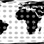
The Lambert Cylindrical Projection
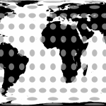
The Berhmann Projection

The Balthasart Projection